Let me tell you about the poster I was going to make.
It was going to be bold. Constructivist-influenced but with a contemporary sensitivity — you know, a nod to Rodchenko without being derivative. I had the color palette worked out: deep vermillion, a warm off-black, maybe a touch of ochre for the secondary type. The typography was going to do a lot of work. I'd been studying it for months. I had opinions about kerning that I was prepared to deploy in service of the people.
I had a whole vision. The Revolution was going to look incredible.
I am now on the 4am shift at a copper ore processing facility, and I want to walk you through exactly how I got here, because I think it might be useful for others who are still in the early stages of this particular journey.
Stage One: Certainty
For most of my twenties, I operated from a position of unshakeable confidence that my specific skills were precisely what radical political transformation required. I was a visual storyteller — that was literally in my bio, 'visual storyteller,' right between 'Brooklyn-based' and 'they/them' — and I had spent years documenting injustice, designing protest graphics, and developing a personal brand that communicated, clearly, that I was one of the good ones.
I had read enough history to know that all great revolutions had produced great visual art. The Soviets had their constructivists. The Cubans had their silkscreen posters. The Chinese Cultural Revolution had — well, the Cultural Revolution had some complicated elements I tended to skip over, but the aesthetics were undeniable.
The point is: revolutions need designers. I was a designer. The math, I felt, was simple.
What I had not done was the other math. The math about ratios.
Stage Two: The Ratio Problem (Denial)
Somewhere around the time I was putting together my revolutionary portfolio — yes, I had a revolutionary portfolio, it was on a Squarespace site with a password I'd share 'with trusted comrades' — someone sent me a link to Soviet labor allocation statistics from the 1930s.
I did not read them carefully. I skimmed them the way you skim a terms-of-service document: quickly, with the assumption that nothing in there applies to you specifically.
What I missed, and what I am now intimately familiar with, is the ratio. In the Soviet Union at peak industrial mobilization, the state employed approximately one graphic designer — and I am being generous with that job title — for every several hundred industrial workers. The propaganda apparatus was real, but it was small. It was curated. There was, at any given moment, roughly one person doing what I wanted to do, and that person had usually been doing it since before the Revolution and had survived several rounds of purges through a combination of talent and strategic flexibility.
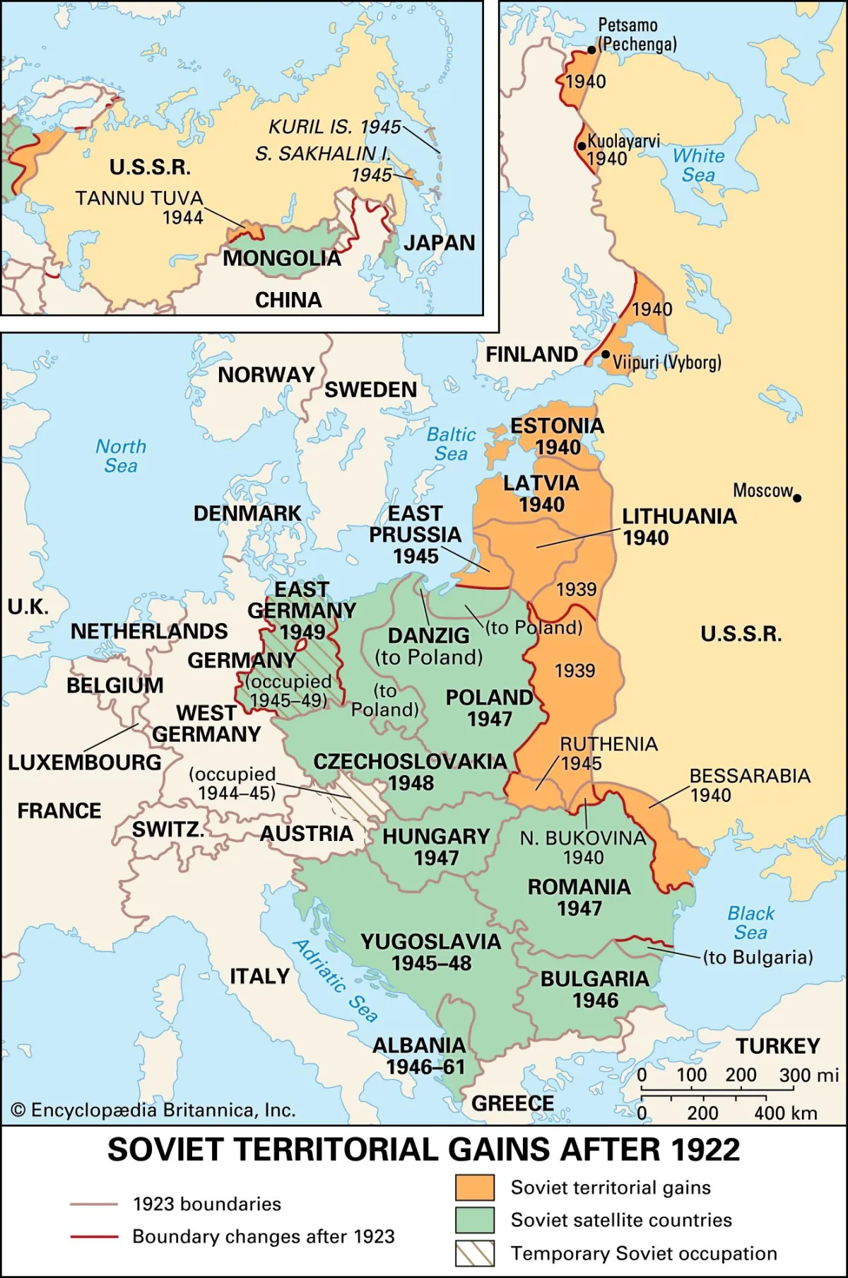 Photo: Soviet Union, via cdn.britannica.com
I was not that person. I had not yet processed that I was not that person.
I told myself the statistics were cherry-picked. I told myself that my revolution would be different — more design-forward, more intentional about visual culture. I started a document called 'Notes Toward a People's Design Manifesto.' It was eleven pages long. I was very proud of it.
The document is gone now. I think about it sometimes, at 4am, when I am sorting ore.
Stage Three: Bargaining
When the reassignment notice came — and if you haven't received yours yet, it comes in the form of a slow, creeping awareness rather than an actual document, though I've heard the actual document described — I did not accept it quietly.
I made a case. I made several cases. I explained that propaganda was a legitimate and historically significant arm of state power, which is true. I explained that visual communication could increase worker productivity by as much as 30%, which is a statistic I found in a Medium article and cannot fully verify. I offered to design the ore processing facility's internal signage, free of charge, as a demonstration of my value.
The Bureau — and by 'Bureau' I mean the general logic of historical communist labor allocation, which I was bargaining with in the abstract — was unimpressed.
Here is what the Bureau said, essentially: There are four people ahead of you for the one design job, all of whom have been doing this longer. There are four thousand tons of copper ore that need sorting. You have hands. Please report Tuesday.
I offered to do a logo. The Bureau does not need a logo. The Bureau is the Bureau. The Bureau has always been the Bureau.
I asked about typography specifically. I had, I explained, very particular expertise in typography. The Bureau noted that the ore processing facility does require signage and that I could, in my off hours, letter the safety notices. This was not the concession I was looking for. I took it anyway, because it was something, and I lettered those safety notices with a level of craft that I maintain was unnecessary but felt important.
Stage Four: Something Like Depression, But Make It Ideological
There's a specific kind of grief that comes from realizing that the political system you advocated for has no particular use for your specific self. Not for you as a person — I want to be clear that I still believe in collective ownership of the means of production in a general sense — but for the version of you that spent $60,000 on an MFA and another $4,000 on a Risograph printer for your studio.
The Risograph is gone. It was collectivized. Someone is using it to print crop rotation schedules, which is, I have to admit, a legitimate use of a Risograph, but it is not my legitimate use, and the distinction matters to me in ways I am still processing.
I spent some time in this stage asking whether the problem was me — whether I had failed to develop skills that were genuinely useful, whether 'visual storyteller' was, as some people had suggested at various points, a job title that raised more questions than it answered. I decided the answer was complicated and moved on.
Stage Five: Acceptance (With One Note About the Lighting)
I am at the ore sorting facility now. I have been here for what feels like a significant portion of my adult life but is actually seven months. The shift starts at 4am. I have learned things about copper ore that I did not expect to learn, and some of them are genuinely interesting — the mineral composition, the color variations, the way different grades catch the light differently when you hold them up.
And here is the thing — and I want to be careful about how I say this, because I don't want it to sound like I've made peace with anything I haven't actually made peace with — the light in this facility, in the early morning, before the full shift arrives, is extraordinary.
The overhead industrials are off until 5am. The only light comes from the eastern windows, which are massive, industrial, and completely unobstructed. The copper ore, spread across the sorting tables, catches it in a way that is genuinely, objectively beautiful. The vermillion tones. The ochre. The warm off-black of the shadow edges.
It's almost exactly the color palette I had planned for the poster.
I have mentioned this to no one at the facility. They would not find it useful. But I think about it every morning at 4:15, in the quiet before the machinery starts, and I hold a piece of ore up to the window, and I think: this is, at minimum, very good reference material.
The Revolution may not have needed my poster. But it turns out I needed the ore.
I'm not sure what that means. I have a lot of time to figure it out.
The 4am shift resumes in approximately six hours. The author's revolutionary portfolio is available upon request, though the Squarespace subscription has lapsed. The password was 'solidarity2019.' It no longer works. Nothing from 2019 works anymore.